
We can agree on the importance of having a website to talk about your nonprofit organization and its cause. With over 345 million people in the United States are using the Internet to find what they are looking for, it’s important to have information of value available for those people to find.
Out of those millions of people using the Internet, nearly 70% of them are using their smart phones to do the searching. That’s over 240 million people in the United States who are searching for information from their smart phone!
Sounds like a pretty good reason to make sure that your organization’s website has a responsive design. With a responsive design, you can take your design that looks great on a desktop computer and make it shifts, or responds, to the size of the screen used for viewing your website.
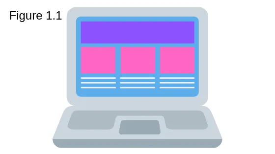
How do you know for sure if your website is responsive? Open your website from a desktop computer, or laptop. Now look at how the pictures, information and buttons are placed. Do you have some sections with multiple rows of information side by side (see figure 1.1)?
Now take the same page you’re looking at from your desktop computer, or laptop, and look at it from your smart phone. How does the same page look now on a much smaller screen (see figure 1.2)? Are the same sections with multiple rows of information sitting side by side and nearly impossible to read because the font is so small (see figure 1.2, left)? If the answer is yes, then you do not have a responsive.
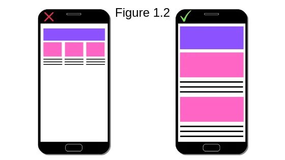
On the other hand, if those same rows have moved to be stacked one on top of the other (see figure 1.2, right), then you likely have at least a responsive website design. If you are seeing a responsive design, then great work! You’re helping make your organization’s information see by many more people than without the responsive design.
If you have a responsive design and think that’s all you need to be concerned about, I’m afraid I have to say that’s incorrect. Not too long ago, in one of the many Google algorithm changes, the system started enforcing what’s called “mobile-first.”
What is Mobile-First?
Google has informed us that they will start crawling and indexing websites using their smart phone agent. What on earth does that even mean?
All the websites you find when you have typed something into the Google Search Engine have had Google computers “crawl”, or search through their content, and then “indexed”, or putting it into a searchable format for Google. When a website is understood by Google’s computers, it can more easily find the words on your website and so they can pull them up when someone is looking for the same words while on Google’s search engine.
So, what does all this have to do with mobile-first? Google is focused on making sure its users are getting the desired content from high quality websites. Google is also keeping a close eye on how many millions of people are now using smart phones to use their search engine. Since people are using more smart phones than desktop computers Google has moved its focus from being concerned about general website design quality to focus on mobile website design quality.
All of that is to say Google is taking mobile, or smart phone, design very serious. With mobile-first, there is a desire for website owners to focus on the design used for mobile before being concerned about the design used for desktop. This is the direct opposite of responsive website design, where you create a design that is optimized for a desktop and can seamlessly shift to a design that usually also optimized for mobile.
Does this mean my responsive website design is going to make me rank lower for the search terms I want to be found by? That is a possibility. The thing to keep in mind is that this is not to say you can’t use responsive design. What you do need to keep in mind is that Google is taking mobile design very serious and so should you. If you decide to keep your website in a responsive design, there are things you can do on the back end to help encourage the best possible mobile experience.
Here are three things to help with optimizing your website for mobile users:
- How large are your images? Are you using high resolution pictures? The bigger the image file, the longer it takes for smart phones to load while viewing your website their phone’s data plan.
- Do a quick review of your plugins. Plugins can provide your website with amazing features and functions, but the more plugins you have the longer it takes to load the different pages. If you find any plugins that aren’t needed, it’s best to remove them from your website.
- Cache your website content, if your website hosting will allow. By caching content, the system stores static information to help reduce the time needed for loading a webpage. There are some hosting providers that have a type of caching it built into their system, make sure to check with the services provided.
Conclusion
When it comes to the design of your organization’s website, it’s important to keep mobile users in mind. Whether you decide to use a responsive design, making sure to focus more on the mobile side of the design, or you invest in a mobile-first design… it’s best to make sure you’re optimized for mobile visitors. There are definite pros and cons to both responsive design and mobile-first.
In addition to mobile friendliness, it’s important to still make sure the content is of value to the people visiting your website. Remember that Google is focused on making sure their users are getting the information they are looking for. Make sure the information you provide helps people find what they are potentially looking for while also educating them on your cause. When people leave your website, without taking any action, Google makes a note of that.
Is your organization’s website mobile optimized? Let’s talk today!
Take The First StepThe Time To Optimize Is Now!

Ready to get started on taking your website to the next level? Let me know how to contact you so we can setup a time to discuss your nonprofit organization. I look forward to hearing from you.